The 10 Best Coronavirus Data Visualizations We’ve Found
The 10 Best Coronavirus Data Visualizations We’ve Found
The 10 Best Coronavirus Data Visualizations We’ve Found
We text articles to friends and family, we post helpful links on the office slack, we pay extra close attention to our local news alerts. Staying current with the coronavirus has become a global group project.
The good news about group projects is everyone gets to play to their strengths. The doctors, nurses, scientists, first responders, teachers, journalists, grocers, and delivery drivers are all doing their parts while many of us are staying home to do our part. But even with constant COVID-19 news coverage, it’s hard to wrap our minds around the numbers. This is where the work of data-driven storytellers really shines.
Visualizing Coronavirus
Many organizations have found ways to explain and visualize (often in near real time) the spread of the virus around the world and its impact. Here are the best resources we’ve found for understanding coronavirus and what’s happening now.
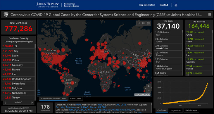
1. Johns Hopkins: Interactive Global Coronavirus Tracker
This dashboard is updated multiple times a day and includes the latest number of confirmed cases, total deaths, and patients who have recovered. At a glance, you can see numbers for countries as well as hard-hit cities, like New York City, New Orleans, and King, Washington. You can click on the map for information specific to your county.
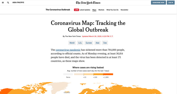
2. The New York Times: Coronavirus Map Tracking the Global Outbreak
Updated regularly, this page features a global map showing where cases are rising the fastest plus a map of the United States with a visual representation of cases per county.
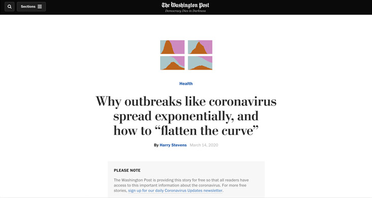
3. The Washington Post: Why outbreaks like coronavirus spread exponentially, and how to “flatten the curve”
The four simulators on this page demonstrate how the virus might spread in a town of 200 people under the following conditions: no restrictions, attempted quarantine, moderate social distancing, extensive social distancing. In addition, you’ll see how each effort flattens (or doesn’t) the curve.
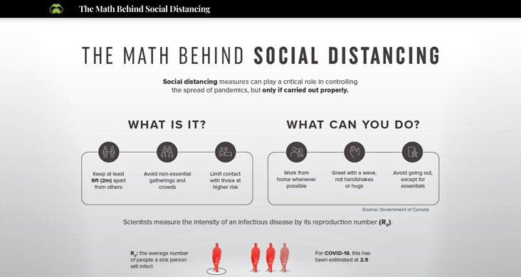
4. Visual Capitalist: The Math Behind Social Distancing
Speaking of social distancing, this infographic shows the difference between reducing social exposure by 75 percent, 50 percent, and not at all. Spoiler alert: The less we practice social distancing, the more the virus spreads.
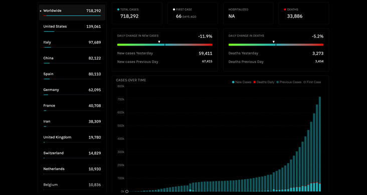
5. STAT: Covid-19 Tracker
The clean design of this dashboard makes it easy to navigate. It pulls data from Johns Hopkins (#1 on the list) as well as the COVID Tracking Project and USAFacts. While not updated as often as the John Hopkins page, this dashboard provides new insights, such as how many days it has been since the first case was reported in a particular area.
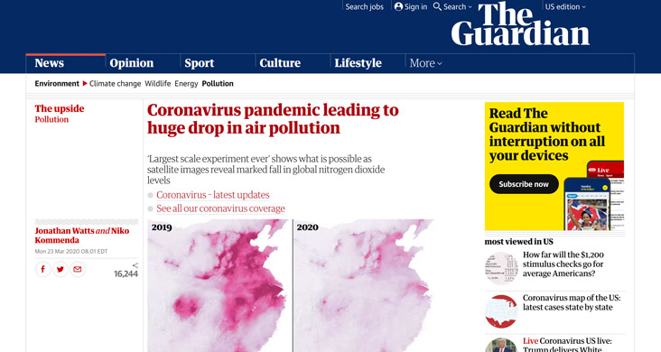
6. The Guardian: Coronavirus pandemic leading to huge drop in air pollution
With so much of the world staying home, the reduction in global nitrogen dioxide levels has been significant. The maps here show the difference in 2019 and 2020 pollution levels for China, South Korea, Italy and the UK.
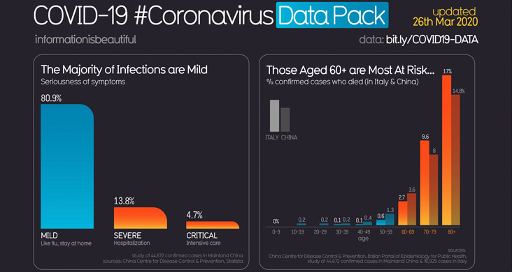
7. Information Is Beautiful: Coronavirus Data Pack
The 10 graphics on this page illustrate a wide range of COVID-19 information, including the seriousness of symptoms, incubation periods, the infections and fatality rates by country, and why it’s important to flatten the curve. The stats here are updated regularly but not daily.

8. Tax Foundation: A Visual Guide to Unemployment Benefit Claims
Here you’ll find maps showing how quickly unemployment claims have risen in each state and the solvency of each state’s unemployment insurance funds. Most notable is a state-by-state comparison showing weekly unemployment claims during the Great Recession compared with the number of claims for the week ending on March 21, 2020.

9. The Weather Channel: Coronavirus (COVID-19) Updates
The Weather Channel now includes coronavirus updates by county and state on both its website and app. In addition to the number of confirmed cases, you’ll also see the number of deaths and the percentage both have changed since last week.
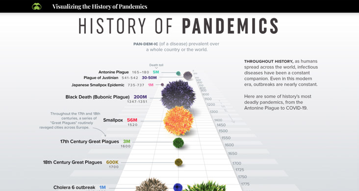
10. Visual Capitalist: The History of Pandemics
Less about coronavirus specifically, this infographic visualizes the history of pandemics dating back to the Antonine Plague from 165-180 A.D. It puts into context the death toll of 20 pandemics and showcases the basic reproduction number (RO) of nine diseases.
The data surrounding coronavirus will continue to evolve as the pandemic spreads to new communities and more about this novel disease becomes known. As this happens, we expect more visuals with new insights will be created to explain our shared global experience. If you see any that should be added to this list, please let us know.